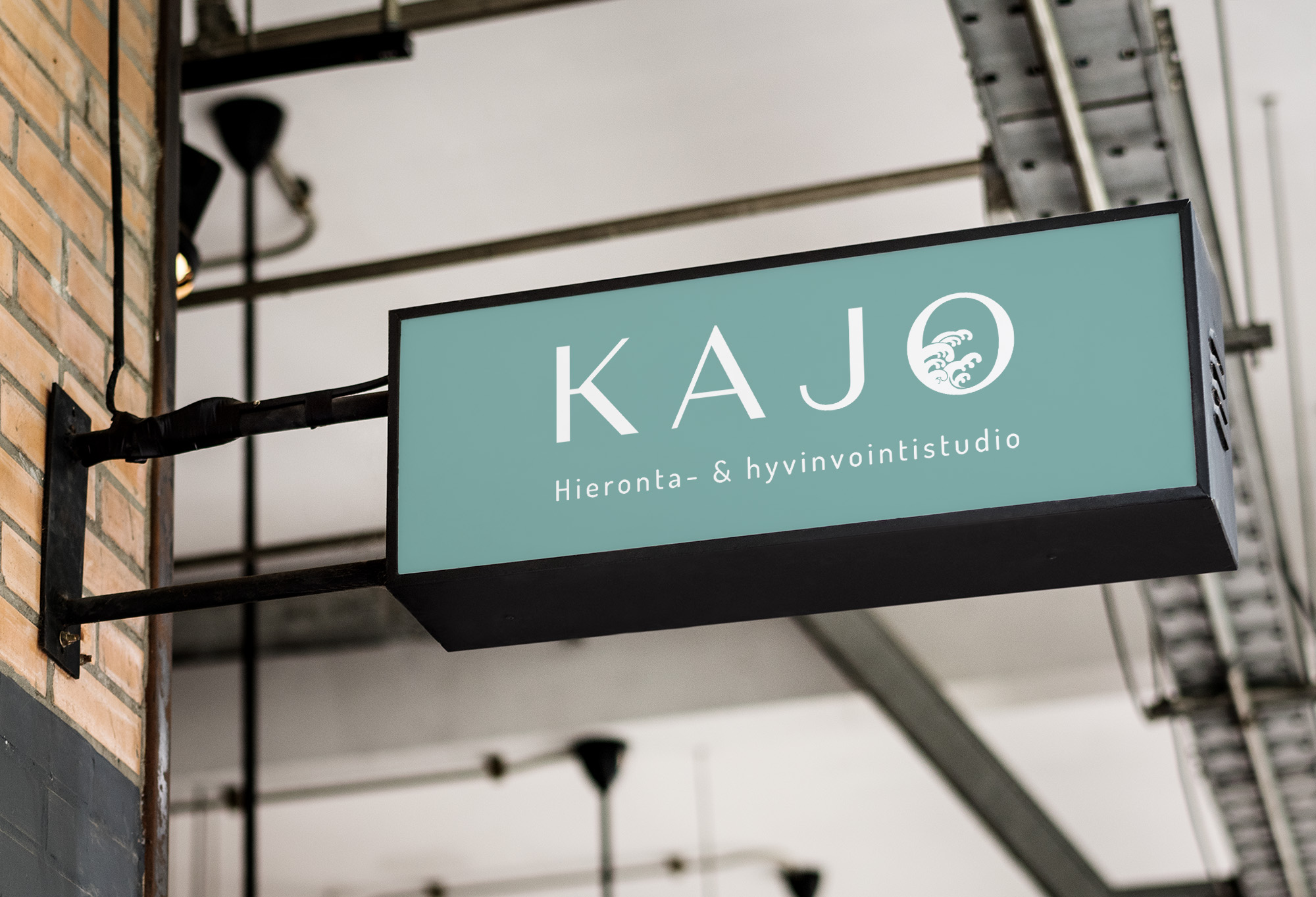
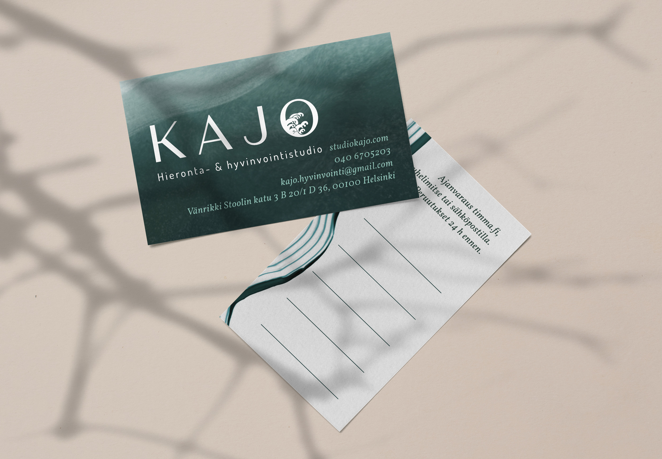
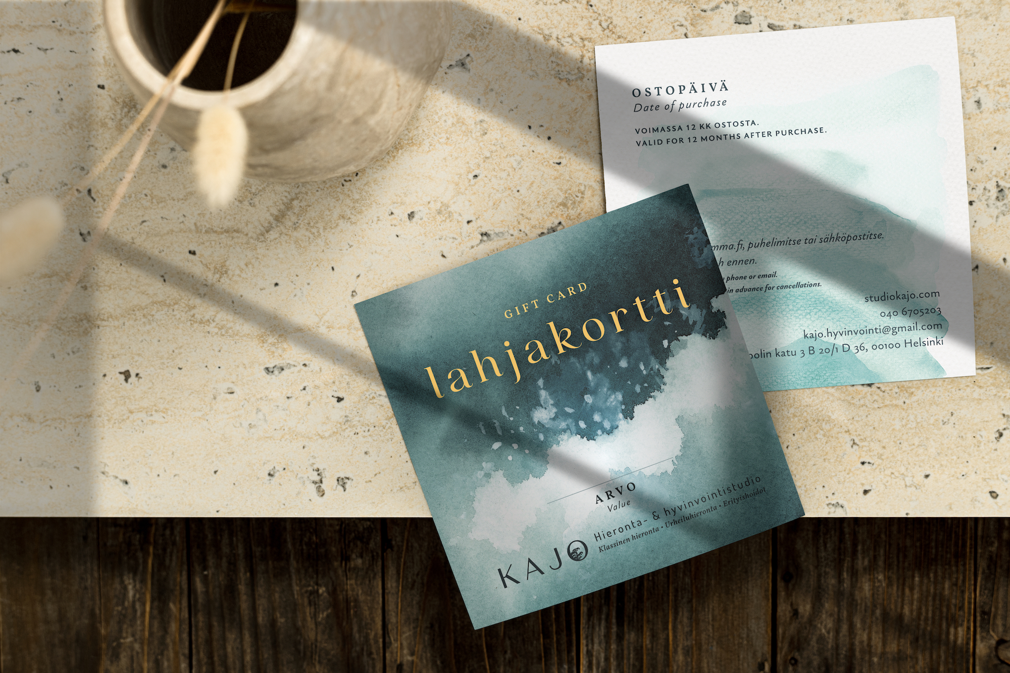
I. H. is the owner and founder of her newly-launched independent massage studio Kajo, named after the word for “glow” or “shimmer” in Finnish. She wanted a logo and collateral that evoked light, calmness, and joy. As a trained massage therapist, she also wanted to make sure the branding would communicate that it was a space that focused on health and wellness instead of beauty.
Role: art direction, graphic design
Deliverables: logo, business card, gift card

I started with a few different concepts based around the letter O. Inspired by the gorgeous mural of an ocean on the studio’s walls, I wanted to depict the waves of a calming sea.
To avoid a “beauty salon” impression, I avoided delicate Didonesque serif fonts. Instead, I opted for Magnat, a sans serif that was modern and professional yet very human. And thanks to the flowing, slightly contrasted strokes in the logo typeface, the waves seamlessly blend into the capital O.


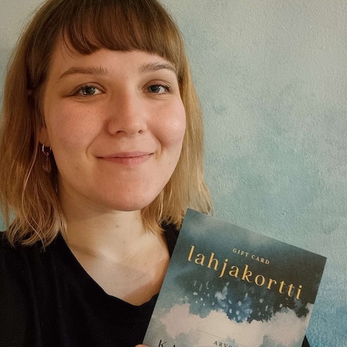
I.H. was delighted with the finished product. In her words, the designs “feel uniquely me and represent my business wonderfully. Having these lovely designs helps me feel even more confident and proud about my new business, and I still get hyped every time I see them”.
